Mobile Bank für kleinere Unternehmen

G-Bank
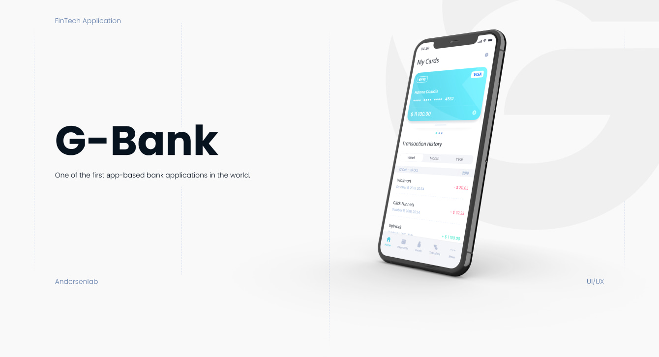
One of the first аpp-based bank applications in the world.
About
Project goal
Platforms
One of the first in the world online bank, entirely based on working online. G-bank app provides you with all the bank services in less than a minute, whenever you need.
Our task was to make a clear and catchy mobile app with usability-friendly design and a convenient visualization of income, payments, transfers and other financial information.
G-bank is a cross-platform application - for both IOS and Android platforms. No matter what kind of device you use, the G-bank app always works fast and stable for you.
Perfection of nature applied in design.
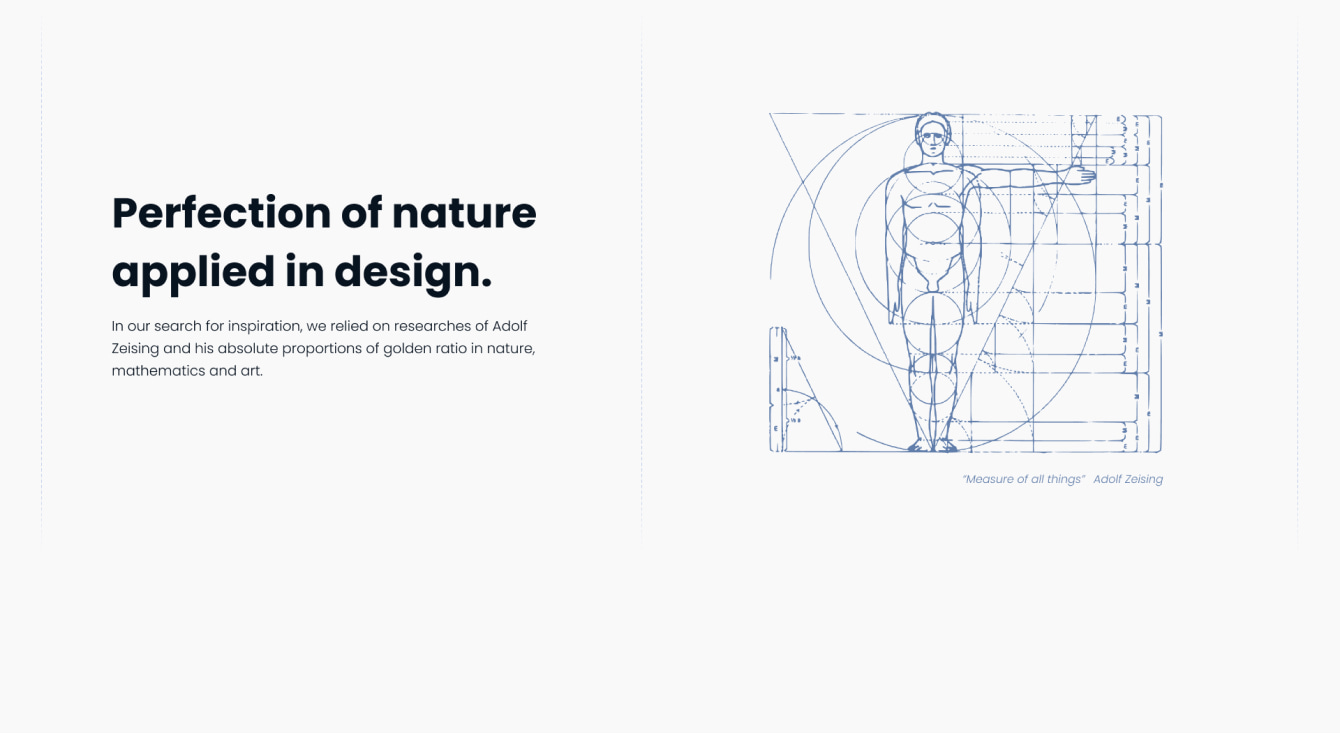
In our search for inspiration, we relied on researches of Adolf Zeising and his absolute proportions of golden ratio in nature, mathematics and art.
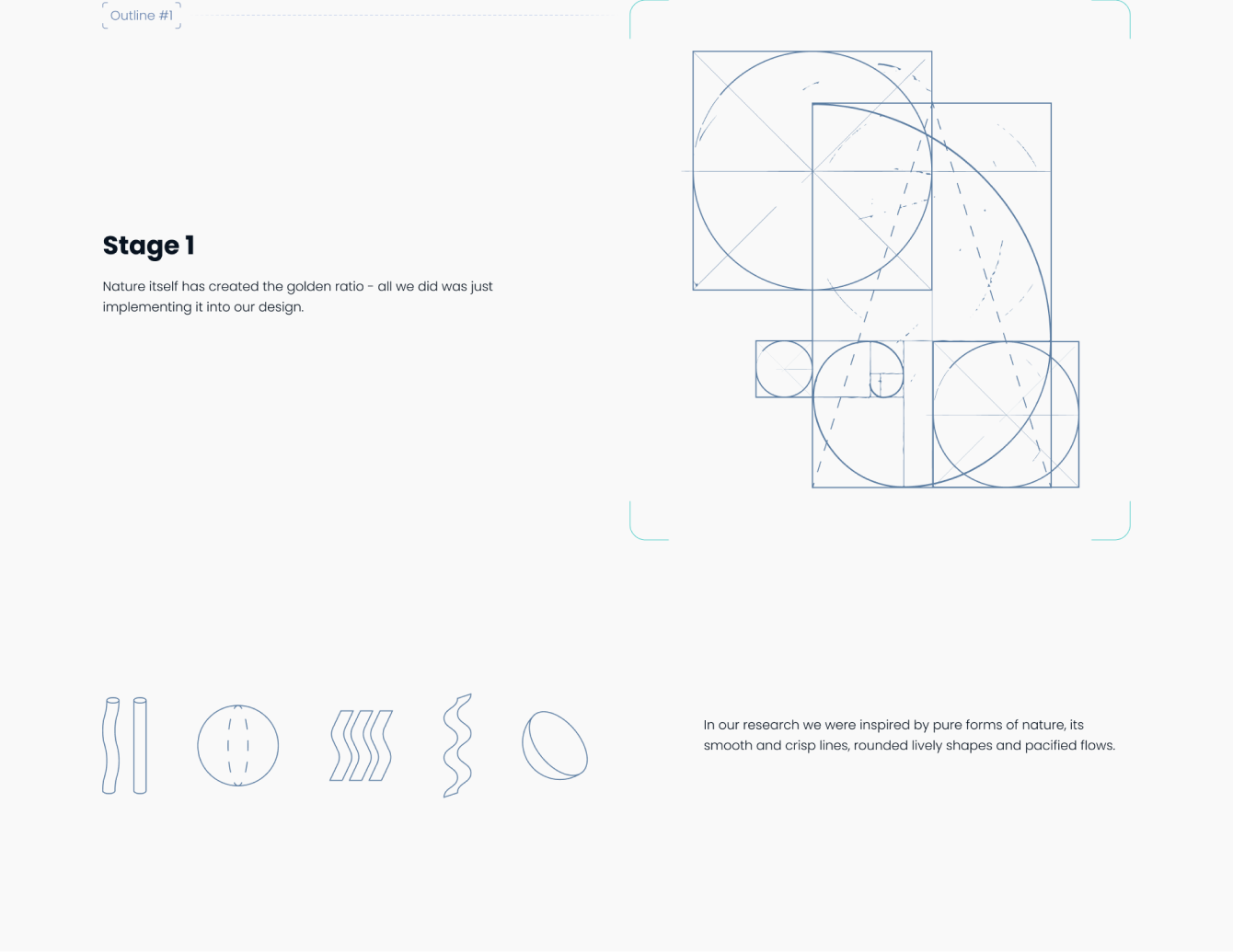
Nature itself has created the golden ratio - all we did was just implementing it into our design.
In our research we were inspired by pure forms of nature, its smooth and crisp lines, rounded lively shapes and pacified flows.
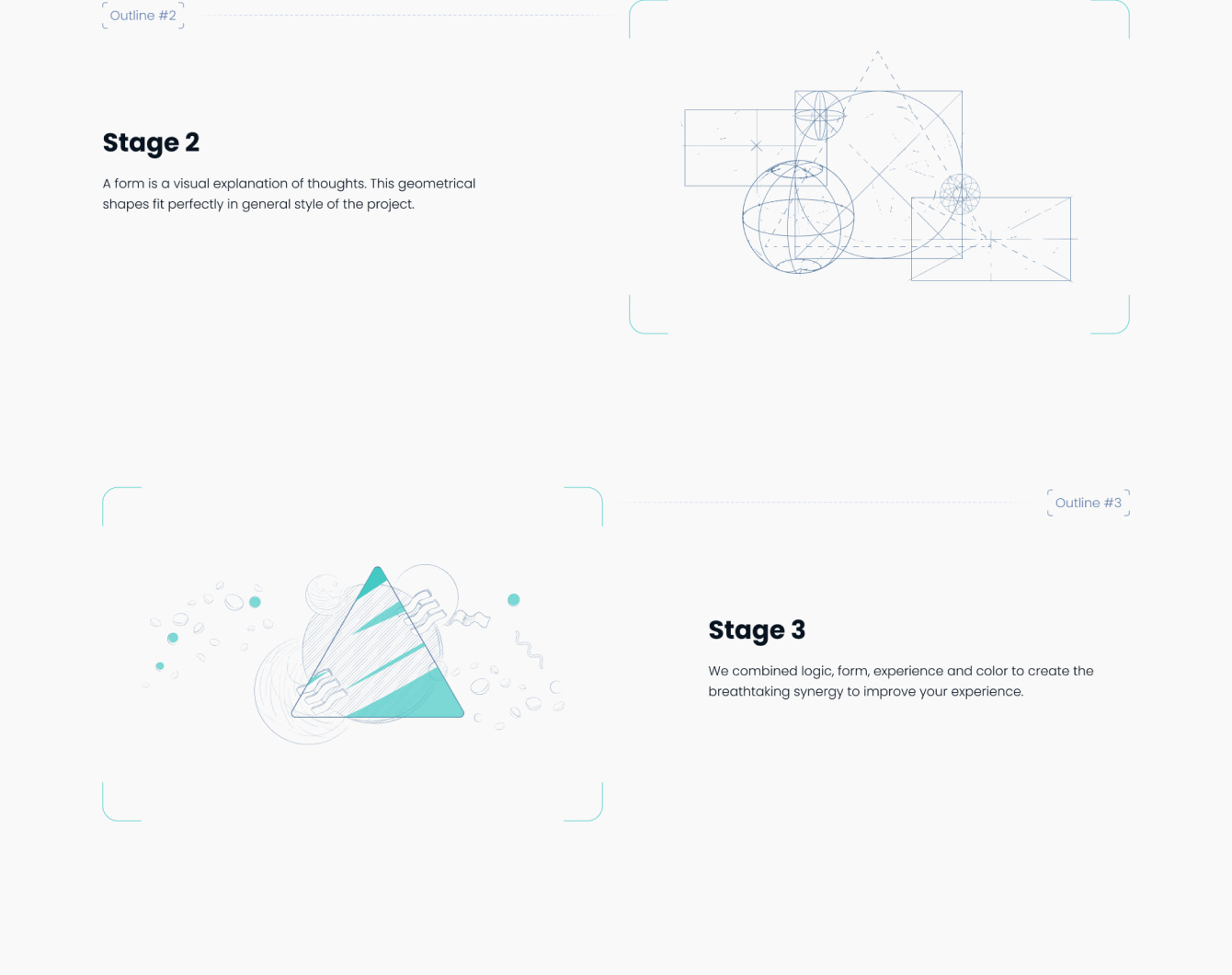
Stage 2
Stage 3
A form is a visual explanation of thoughts. This geometrical shapes fit perfectly in general style of the project.
We combined logic, form, experience and color to create the breathtaking synergy to improve your experience.

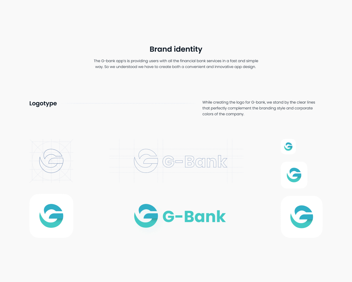
The G-bank app’s is providing users with all the financial bank services in a fast and simple way. So we understood we have to create both a convenient and innovative app design.
While creating the logo for G-bank, we stand by the clear lines that perfectly complement the branding style and corporate colors of the company.
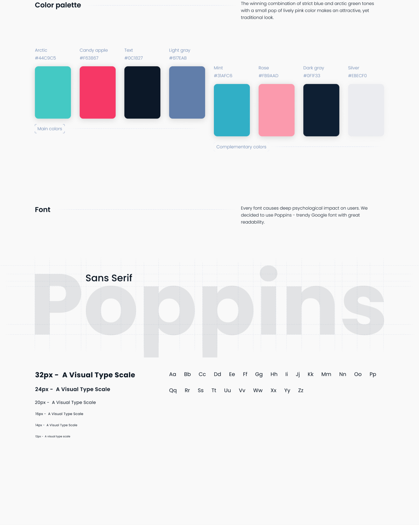
The winning combination of strict blue and arctic green tones with a small pop of lively pink color makes an attractive, yet traditional look.
Every font causes deep psychological impact on users. We decided to use Poppins - trendy Google font with great readability.
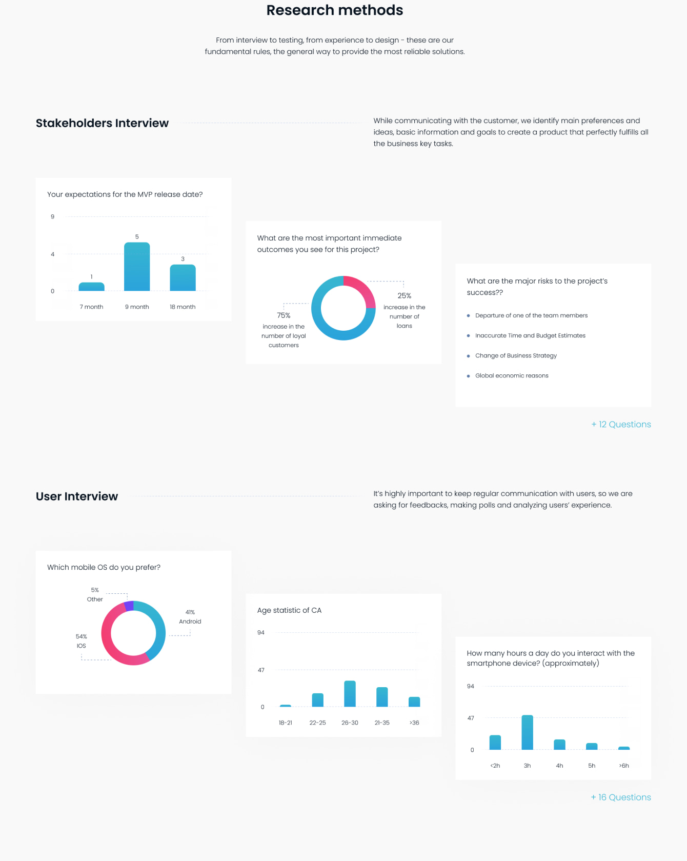
Research methods
Stakeholders Interview
User Interview
From interview to testing, from experience to design - these are our fundamental rules, the general way to provide the most reliable solutions.
While communicating with the customer, we identify main preferences and ideas, basic information and goals to create a product that perfectly fulfills all the business key tasks.
It’s highly important to keep regular communication with users, so we are asking for feedbacks, making polls and analyzing users’ experience.
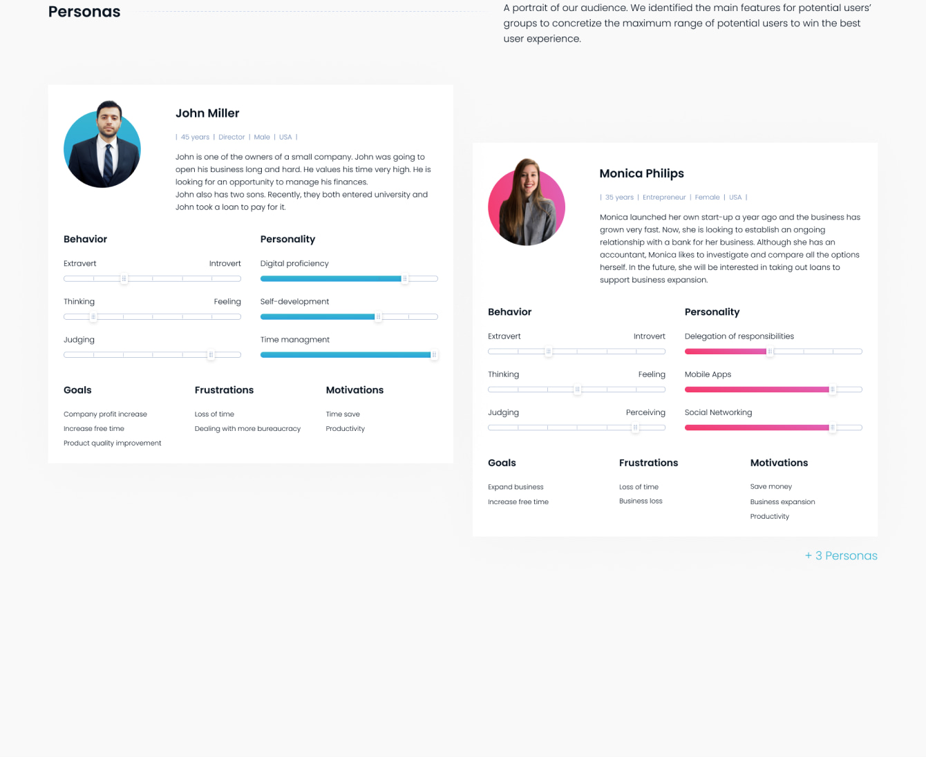
Personas
John Miller
Monica Philips
A portrait of our audience. We identified the main features for potential users’ groups to concretize the maximum range of potential users to win the best user experience.
John is one of the owners of a small company. John was going to open his business long and hard. He values his time very high. He is looking for an opportunity to manage his finances. John also has two sons. Recently, they both entered university and John took a loan to pay for it.
Monica launched her own start-up a year ago and the business has grown very fast. Now, she is looking to establish an ongoing relationship with a bank for her business. Although she has an accountant, Monica likes to investigate and compare all the options herself. In the future, she will be interested in taking out loans to support business expansion.
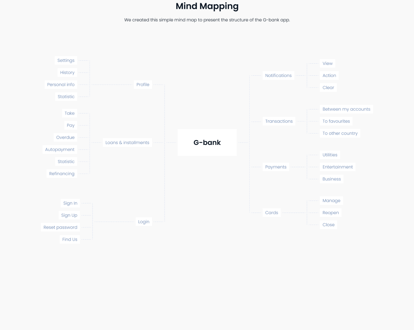
Mind Mapping
We created this simple mind map to present the structure of the G-bank app.
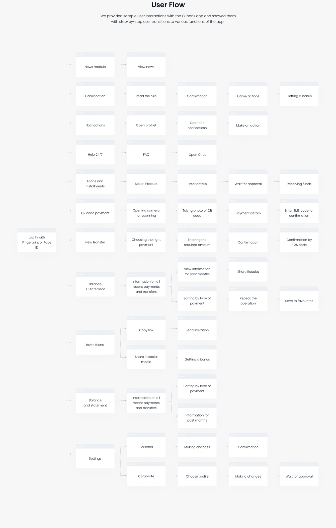
User Flow
We provided sample user interactions with the G-bank app and showed them with step-by-step user transitions to various functions of the app.
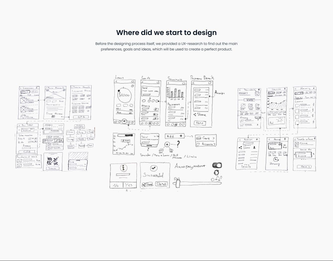
Where did we start to design
Before the designing process itself, we provided a UX-research to find out the main preferences, goals and ideas, which will be used to create a perfect product.
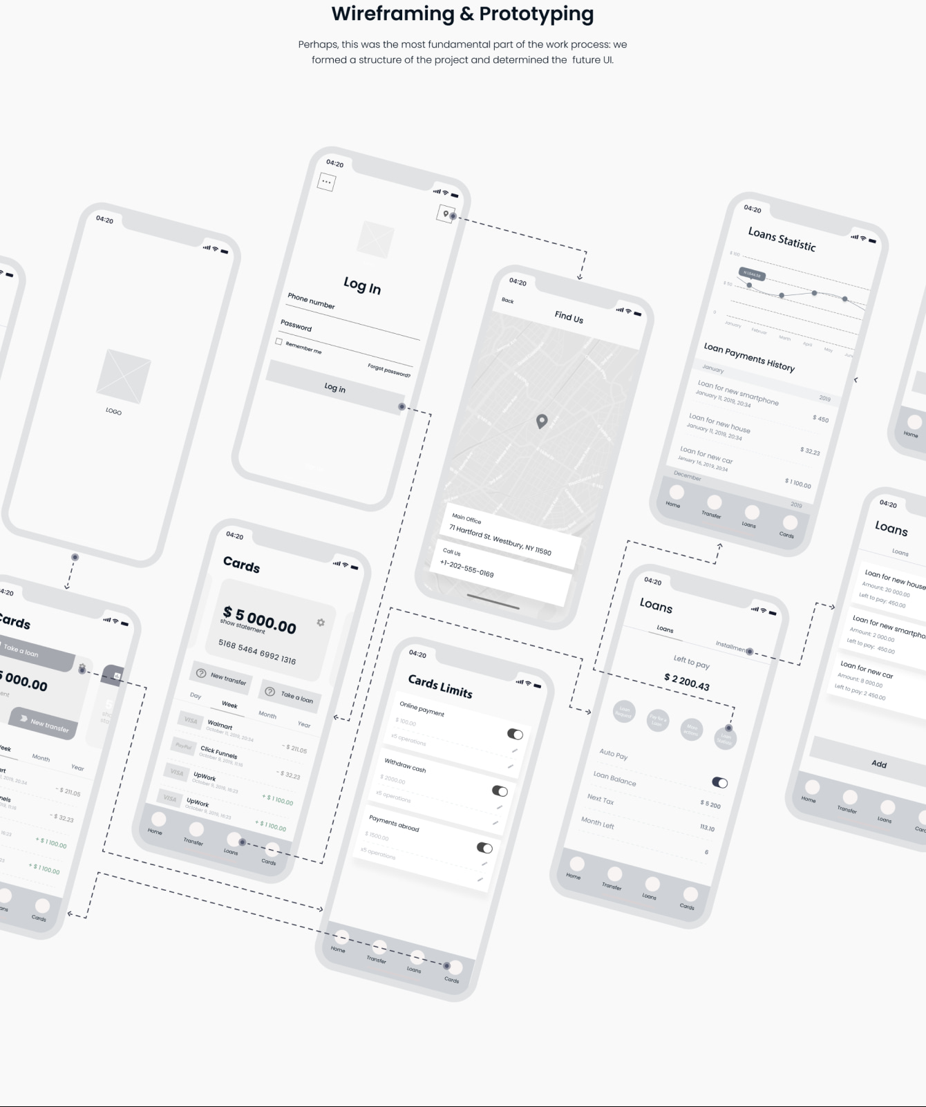
Wireframing & Prototyping
Perhaps, this was the most fundamental part of the work process: we formed a structure of the project and determined the future UI.
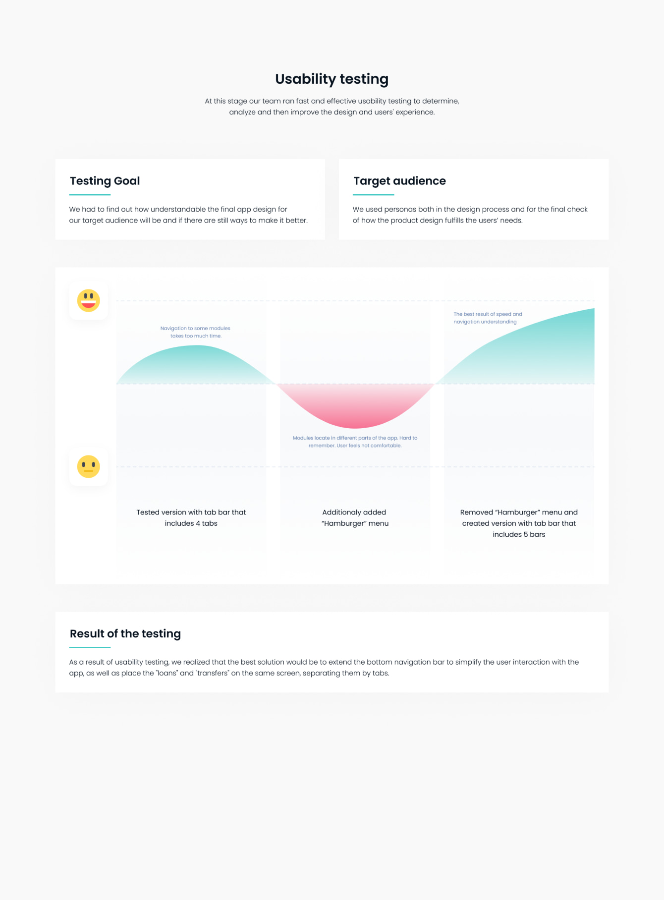
Usability testing
Testing Goal
Target audience
Result of the testing
At this stage our team ran fast and effective usability testing to determine, analyze and then improve the design and users' experience.
We had to find out how understandable the final app design for our target audience will be and if there are still ways to make it better.
We used personas both in the design process and for the final check of how the product design fulfills the users’ needs.
As a result of usability testing, we realized that the best solution would be to extend the bottom navigation bar to simplify the user interaction with the app, as well as place the "loans" and "transfers" on the same screen, separating them by tabs.
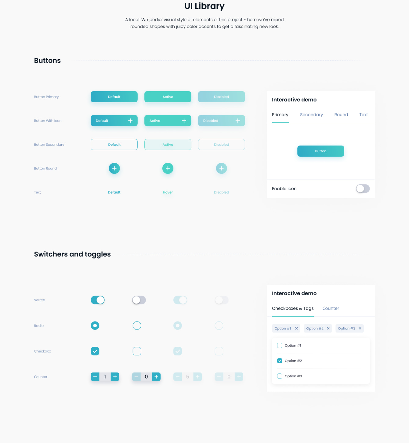
UI Library
Buttons
Switchers and toggles
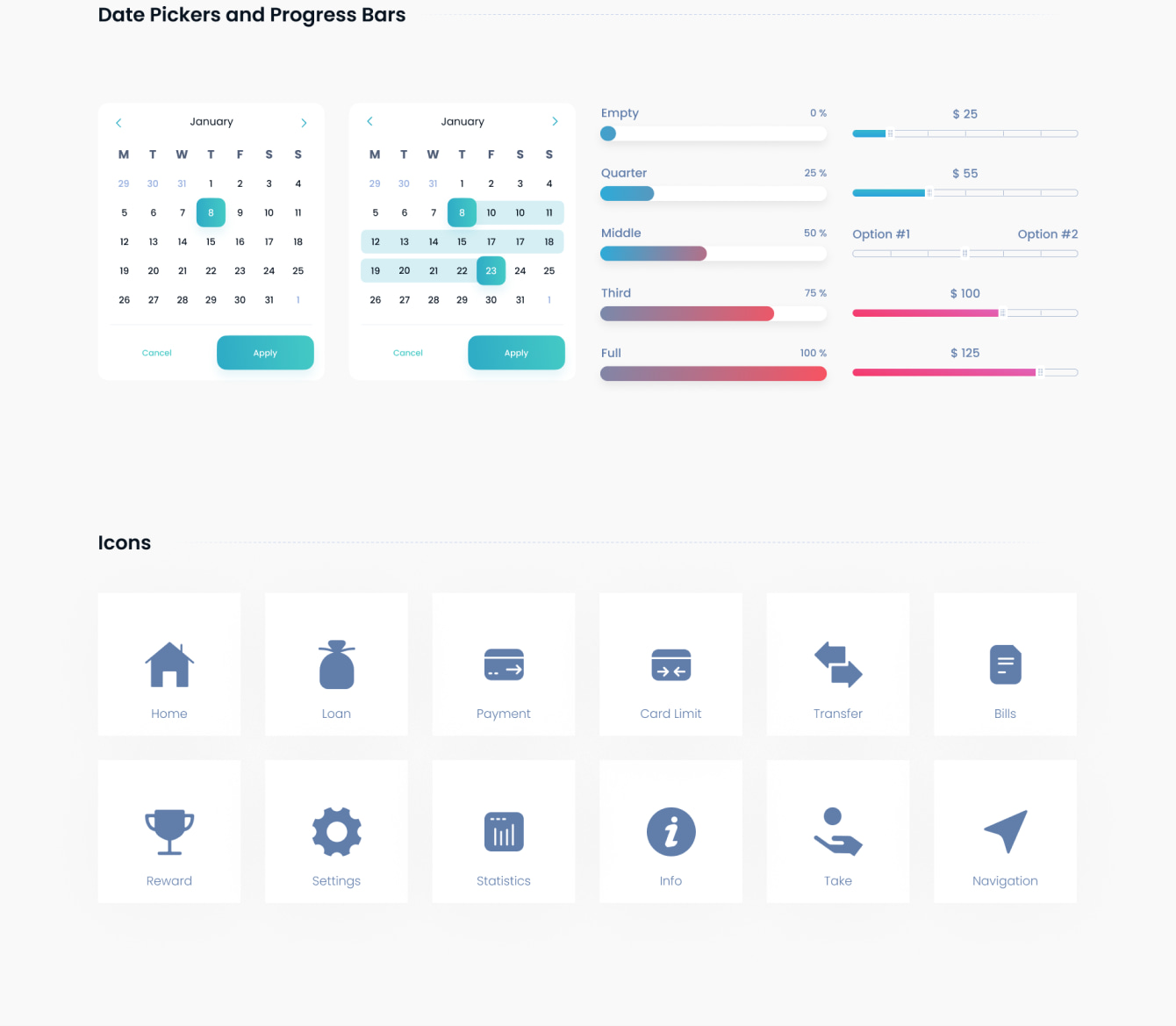
Date Pickers and Progress Bars
Icons
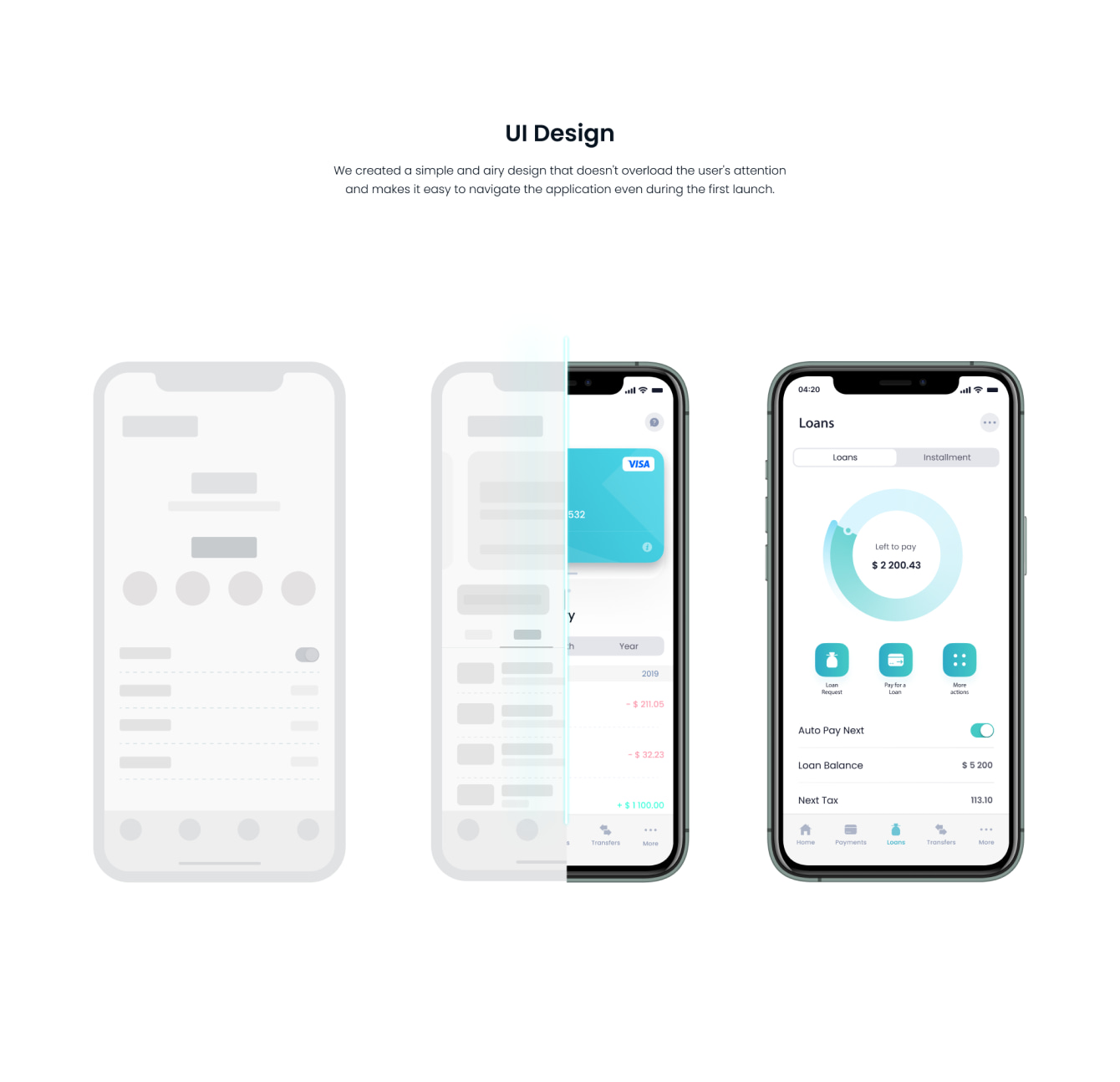
UI Design
We created a simple and airy design that doesn't overload the user's attention and makes it easy to navigate the application even during the first launch.
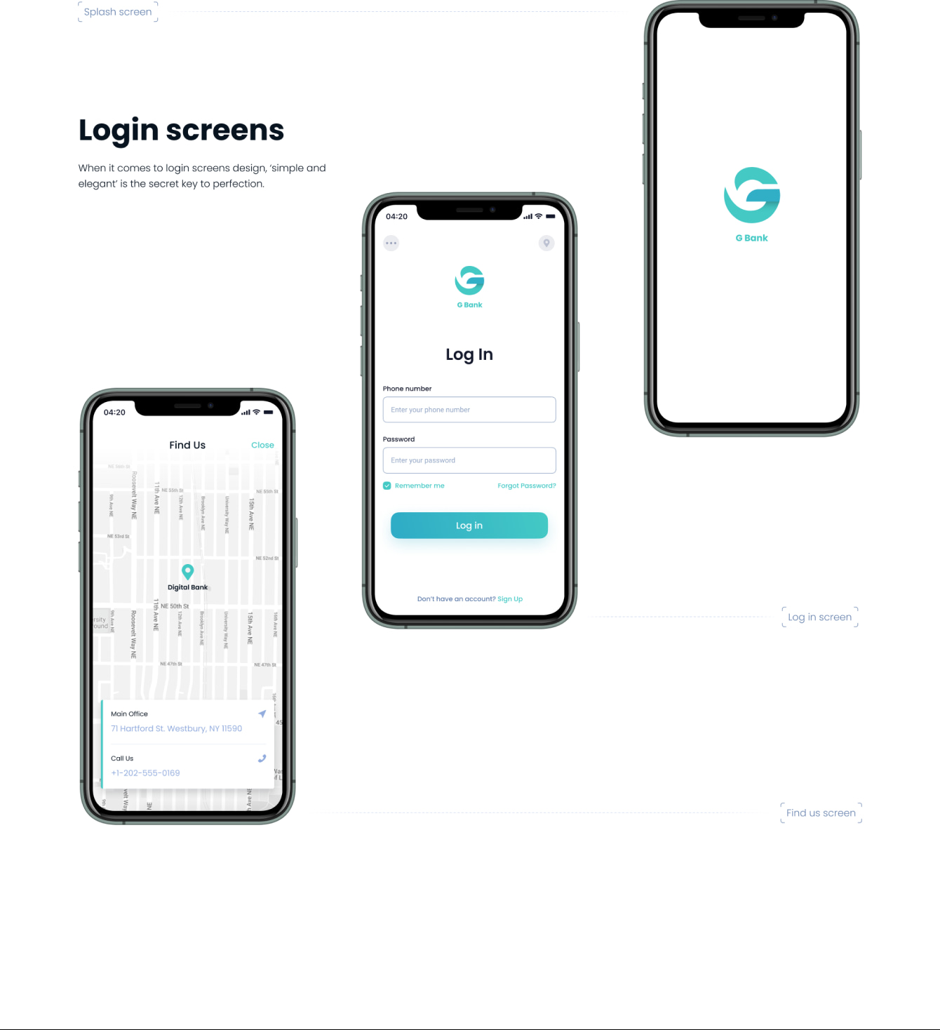
Login screens
When it comes to login screens design, ‘simple and elegant’ is the secret key to perfection.
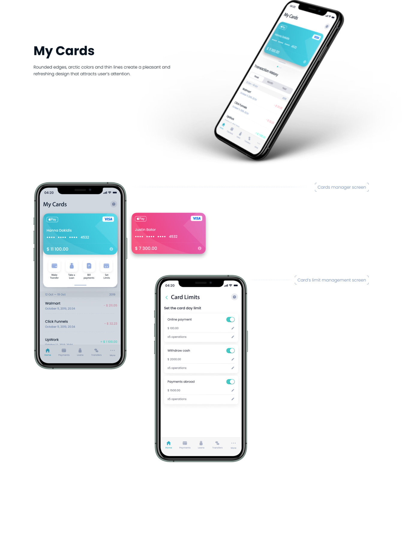
My Cards
Rounded edges, arctic colors and thin lines create a pleasant and refreshing design that attracts user’s attention.
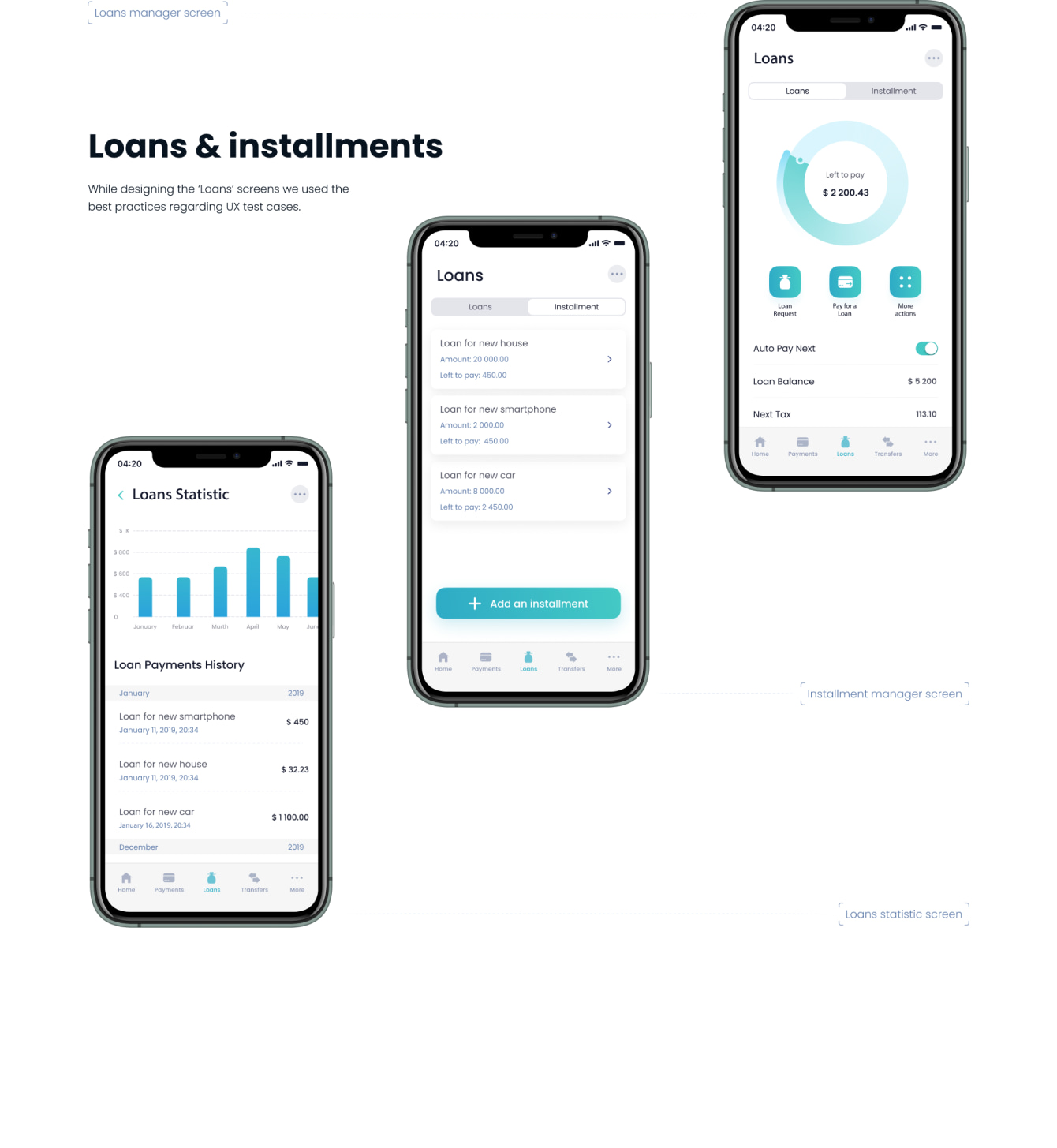
Loans & installments
While designing the ‘Loans’ screens we used the best practices regarding UX test cases.
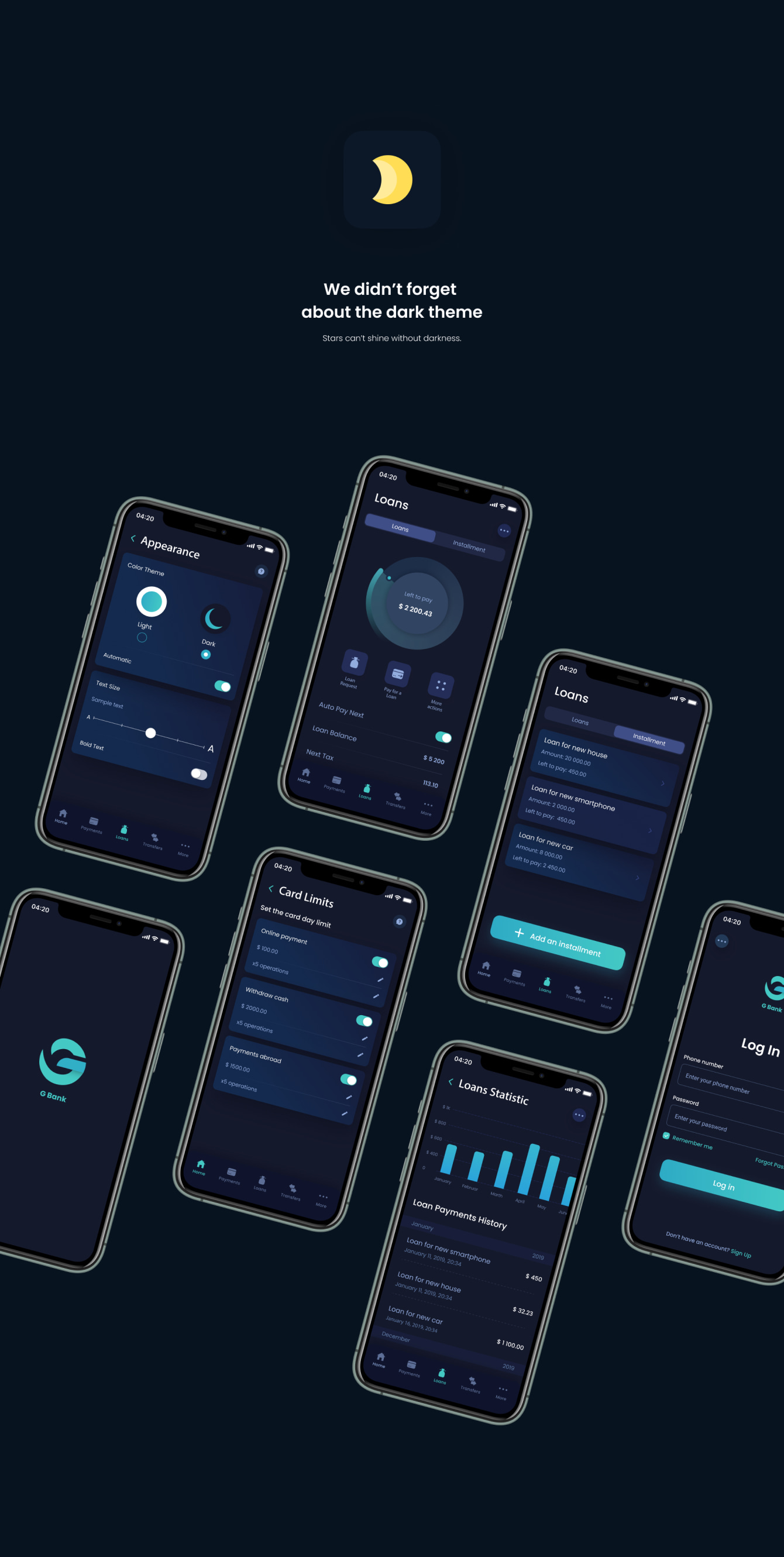
We didn’t forget about the dark theme
Stars can’t shine without darkness.
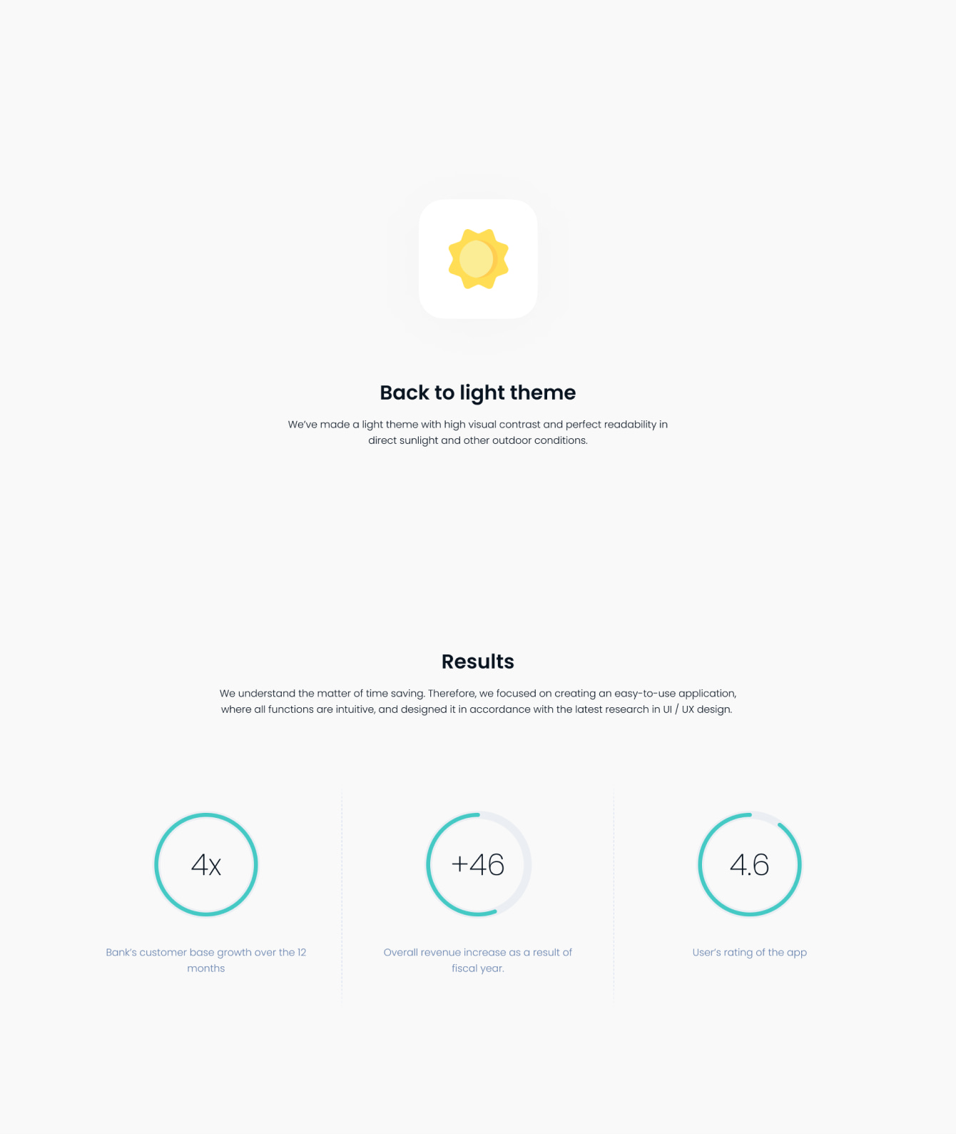
Back to light theme
Results
We’ve made a light theme with high visual contrast and perfect readability in direct sunlight and other outdoor conditions.
We understand the matter of time saving. Therefore, we focused on creating an easy-to-use application, where all functions are intuitive, and designed it in accordance with the latest research in UI / UX design.
Kostenlose Beratung anfordern
Weitere Schritte
Nachdem wir Ihre Anforderungen analysiert haben, meldet ein Experte bei Ihnen;
Bei Bedarf unterzeichnen wir ein NDA, um den höchsten Datenschutz sicherzustellen;
Wir legen ein umfassendes Projektangebot mit Kostenschätzungen, Fristen, CVs usw. vor.
Kunden, die uns vertrauen:

